Over on Mind The Gap, Steve Wilkins (Twitter) has a poster about patient engagement that annoyed me:-) right out of the box – because although I pretty much like everything he does, the poster starts with what I find to be the ouchiest mental disconnect in all of medicine today. But it quickly follows with the flipside. Here’s a screen grab from its top:

Gut reaction to first quote: What?? “The lack of patient engagement is the Achilles Heel of health care delivery”?? Shades of Health Leaders magazine last October, which said – in an issue on Engaging the Patient no less! –
In our annual Industry Survey, leaders cite patient noncompliance and lack of responsibility as the fifth-greatest driver of healthcare costs … a quarter of respondents pointed to patients as among the top three cost drivers, ahead of health plan overhead, medical devices, pharmaceuticals, and malpractice litigation.
I love it – patient satisfaction scores are generally mediocre, 1 in 70 Medicare admissions ends in accidental death (Inspector General, Nov 2010), and the people who run these chop shops blame costs on their slacker customers. Sounds like scapegoating to me!
And this is the magazine whose September 2009 cover story was “Patient of the Future,” about e-patients, and whose Dec. 2010 “Twenty People Who Make Healthcare Better” cited two SPM founders. (Re the survey, don’t blame the messenger (the editors) for their readers’ views. The magazine does know how to hear its customers!)
I don’t know Dr. McGeeney (author of that quote in the poster) (I’d love to meet him/her), but holy cow, Achilles heel? How about access to care, disparities, cost of care, listening to what patients value, etc? It’s particularly perverse to have a system where care is unaffordable to many, or hard to get to, and then assert that the problem is that patient engagement is the Achilles heel of care delivery.
I recently heard a prominent executive say “One of the dragons we need to slay is the idea that care should be convenient.” I’m not kidding.

(c) Smart Health Messaging
But then:
Second quote: “The problem’s not so much that patients are unengaged but that providers aren’t always very engaging.” Ahhh, thank goodness: it’s a partnership! Who knew??
The poster goes on to list many items that cause trouble on the front lines: harried practitioners, interrupting, etc etc. All valid points.
My favorite, visually, is this cartoon. (All clinicians aren’t like this! None of mine are, for sure. This is a cartoon that effectively depicts a common problem, not a universal one.)
So, before coming over here to write this, I dumped this comment on Steve’s post:
I need to write something about the dimensions of patient engagement.
To a lot of people it’s a synonym for compliance – obedience. In my experience many observers of healthcare see *many* patients not following instructions and conclude “[all] patients are not engaged.” In the observed cases that may be accurate but in my experience too often this blinds the observer to a useful question: what can be done to *interest* the patient in doing more good things?
A common issue, again in my experience, is that in many cases the goals are imposed by the clinician. That makes no more sense than a financial advisor saying “You should be saving 20%. You’re non-compliant.” Note, I’m not disagreeing with the principle or the evidence here; I’m just saying, let’s do things that WORK, let’s FIND approaches that work.
AND, as another layer, activated e-patients who want to redesign the care system feel that the system itself is pretty frickin’ non-responsive, I might add. :-) The huge difference is that we the patients are the BUYERS of services done to us (usually through our insurance), so it’s odd and perverse when some providers not to ask what WE want, individually and collectively.
And that, I suspect, is a root issue in exploring what “patient centered care” is.
So now I gotta email you about your patient engagement white paper to see whether you agree. :-)
====
p.s. Steve and everyone, can we please stop calling every data poster an “infographic”?? A poster like this is a dressed-up presentation of a bunch of facts. It’s nice; it’s a more enjoyable way to absorb facts than a row of numbers. But to me an infographic is when the graphic adds information, rather than just dressing it up.
Example: in this, from Misfitwearables.com, the layout makes it easier to understand the data, not just to read it: the layout shows the relative position of each sport on two scales at once – cost of getting into it, and caloric benefit.
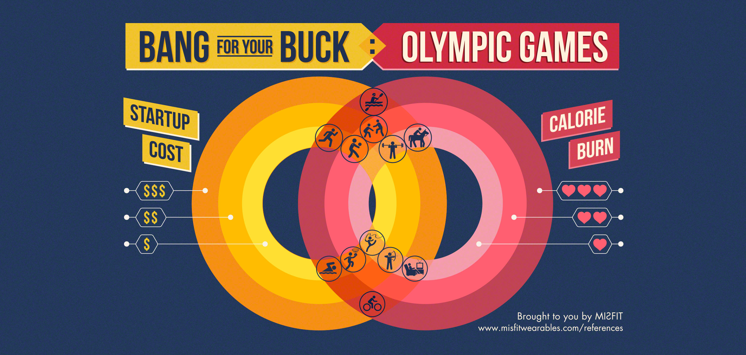
For instance, running is on the cheap inner circle, cost-wise, and on the rich calorie-burn circle; equestrian is expensive and doesn’t burn much. See how the layout helps you see the relationships among the data points?
As Edward Tufte pointed out long ago, useful data visualizations are multivariate – they depict several things at once. That’s how the graphic adds information – it shows the relationship between data points, not just the data points themselves.
And that helps people understand things. And that’s a good thing.


Patient engagement and compliance are two orthogonal things. An engaged patient may or may not be compliant, a compliant patient may or may not be engaged. A physician friend and I were discuss this (in the context of Parkinson’s, a disease that often results in dementia) and he told me that he never uses the word compliance unless the patient is showing signs of dementia. It is far more important to engage patients and to leverage that engagement to share a decision making process about care the engaged patient will participate in than it is for a physician to issue instructions and measure compliance. If the prescription is for, say, strenuous physical exercise, the engaged patient will understand why and do strenuous exercise. The compliant patient may do a strenuous modality (running, biking) but perhaps at a leisurely pace, thus checking the box but not getting the benefit.
Many times, engaged patients are not compliant because they prefer a poorly managed symptom to a terrible side-effect. Gene Nelson of Dartmouth includes patient satisfaction with care and patient-reported outcomes as two of his four dimensions in the “quality compass” — many of us agree that the goal of medicine is to reduce the burden of health problems, not reduce health problems (i.e., treating to the test) at any cost.
> Many times, engaged patients are not compliant because
> they prefer a poorly managed symptom to a terrible side-effect.
And THAT’s a great example of a patient-centered criterion. I have a slide that says “If the microscope’s happy but the patient’s not, has CARE been achieved?”
> An engaged patient may or may not be compliant,
> a compliant patient may or may not be engaged.
I agree, but trust me, to a lot of people out there in the practices, the two are synonyms. That’s why I said I need to write something about the dimensions of patient engagement.
There’s activation (a la Hibbard & the P.A.M. scale), there’s fulfillment of the care plan, there’s *listening* during the visit (a bi-directional form of engagement), and, you and I assert, there’s even defining what the priority of care is, not to mention the choice of methods of how to get there.
You and I agree about that disconnect, but I’m certain that it’s not recognized nearly widely enough.
I was once involved in a study where we were testing tools to increase compliance. Over the course of our study, we increased compliance over 6 months from 37% in our control arm to 75% in our intervention arm. However, at the end of the study I started to get insight into the really terrible side effects of the drug we were supporting and the really marginal benefit over the 2nd choice medication. At the end of the study, I felt guilty for the people whose lives were changed for the worse because I helped to keep them on this drug.
Dave – I understand your sensitivity…but I’m gonna give the poster a pass here.
I believe that what was meant was that the lack of engagement on the physician side was the weak spot. The consequence of that is lack of patient engagement – since it takes two to tango. Or reach a proper diagnosis and treatment plan.
If I’m correct, the poster was aimed at the healthcare providers. Which leads me to believe that the perceived statement of criticism is also aimed at the healthcare providers.
Honestly, with the ramping up of financial pressure on the practices, and the need to process more patients faster, I don’t see this getting better. Not that I won’t be fighting that on an individual level.
Just my own opinion…
– Jeff
Sure, Jeff – I tried to make clear that my initial reaction was then flipped by the next quote, and was then backed up by a bunch of other specifics.
I did, then, also rant a lot about the perspective in that first quote … which indeed didn’t represent the whole poster.
Good to hear from you – thanks.
Even the very word “compliant” makes my head hurt.
Its dictionary definition: “…inclined to agree with others or obey rules, esp. to an excessive degree.”
Why on God’s green earth does this patriarchal terminology continue to exist in medicine? Love your financial planner analogy, by the way – see how stupid that word usage would sound if we were talking about our investment advice?
Some docs are attempting to use less-loaded words like “adherent” to replace the offending “compliant” (but even that term might imply that those who are not “adherent” to doctor’s orders are thus “non-adherents”).
Can we not agree to some kind of informal pact to just stop using the C-word from now on?
regards,
C.
In speeches sometimes I call it “achievement” – but that only makes sense if it’s a shared goal… and that’s kinda my point.
Dave,
Thanks for reading Mind the Gap. We should exchange blog links.
Steve Wilkins
Yeah, except we don’t do link exchanges, don’t even have a blog roll.
But we should talk.
I’m on my last holiday weekend right now … more later!
Still pretty new to these topics, but it seems that the payer (insurance, medicare, etc) could also have a huge influence on an “engagement” metrics.
Essentially, it seems that the payer is the 800-lb gorilla sitting quietly in the corner of the room that no one wants to acknowledge, but is really scared to death of. And it will continue to sit and watch quietly as long as its own metrics are met (pts/day, minutes/visit, etc)
Then it starts knocking everyone around
Scott,
While health plans are normally considered the 800 pound gorilla…not so in the case of engagement. The main member engagement tool available to health plans turns out to be their member portal where members can go for information – health plan related and health related. Because people have relationships with doctors and not health plans (with some notable exceptions)member use of these web portals is around 7%. And that’s nothing to brag about….
Steve Wilkins
Hi Steve,
Thanks for the reply… The patient’s relationship with their health plan wasn’t really my thought.
I was thinking about the gorilla as something that could have a definite influence on the patient/HCP relationship.
As savings start to become more and more “critical”, additional pressures will be placed on that relationship. Everything from the amount of time I can spend with my doctor to what medications I can take at what cost.
I recently had to do a pre-authorization for the insulin I use. They had completely dropped all non-Lilly insulins from their formulary. I am unable to use the recommended alternative because I am basically allergic to it (not the insulin itself, but probably something else in the formulation).
While it was a somewhat minor incident and I got the authorization, it did make my doctor’s office and myself jump through yet another hoop.
The more I’m sitting here thinking about this, I’m wondering if some people may be equating ACOs with the long despised HMO insurance model. That dropping of certain insulins from formularies is something I experienced before when I had an HMO.
I’ll stop rambling now…
Scott Strange