 A patient’s ability to choose the provider they want depends largely on information – same as any other choice, right? So this blog has long praised The Leapfrog Group for its deep analysis and publication of hospital quality and safety data, through its Hospital Safety Scores service.
Note that this isn’t just a “patient power” issue – if we don’t have this information, we can’t reward the hard working people who are doing a good job at their hospital. I point this out because whenever data like this comes out, most of what we hear from providers is “Our low score isn’t justified!” with hardly anyone praising the excellent. Let’s do that!
The news:
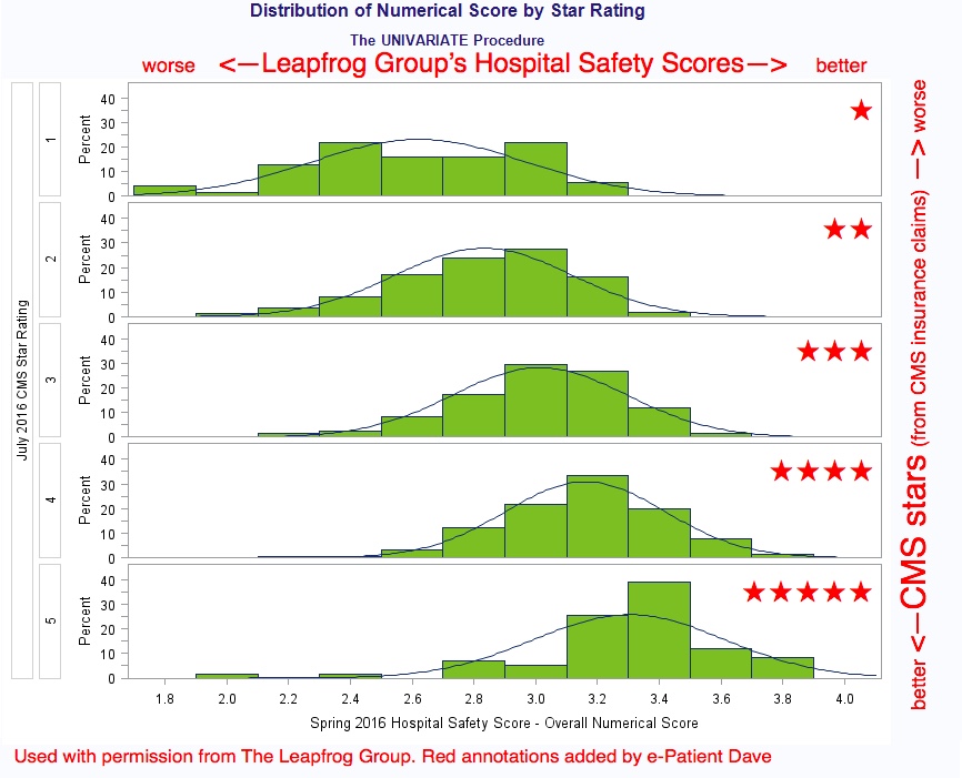
On Wednesday CMS announced its new “Overall Hospital Quality Star Rating on Hospital Compare.” It’s a simplified summary (“overall quality”) of the many variables that for years have been reported on the Hospital Compare site.
As the graph above shows, CMS’s ratings correlate with Leapfrog’s. (Hospital Compare is the same data source Leapfrog uses, but CMS selected different variables.) The differences show that it’s still wise to be a thoughtful shopper (nobody’s perfect); at the same time, the similarities make pretty clear that some hospitals are better than others.
Here’s Leapfrog’s announcement too, from which that graphic was taken.
Are these ratings sound and sensible?
 CMS (Centers for Medicare and Medicaid Services) is the US agency that pays for all Federally-paid healthcare. As a result, they have all the data about what they got billed for – and that data can be analyzed, like any data, to find patterns of good and bad.
Except that for years, hospitals protested and tried to block publication of the data. And every time ratings have been published, the people with the lowest ratings have argued that the system ain’t fair. (Seems to me I first heard that response in third grade.)
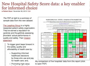
In fairness, it’s important for any informed consumer to look behind the press releases. That’s what we did in 2012 to analyze Leapfrog’s ratings – click the screen capture at right: we dug into specific variables to see what a typical high-rated hospital looks like, and mid-rated ones, and low-rated ones. You’ll see there are no absolute patterns (i.e. nobody’s perfect) but there are clear broad patterns.
Shop carefully for your momma’s hospital, or your baby’s, or your own! Use this information. Remember, nobody’s perfect, but we think consumers deserve to know – and we think great providers deserve recognition.


Dave, I finally posted my blog on this topic today. I took a broad view of the value of more source data & improved methodologies from CMS and other quality measuring orgs (such as NCQA) as inputs for data publishers to use to create aggregated information tools for consumers. The need to search based on providers within one’s health plan’s network, for example, is so critical to creating a truly useful tool. See my website for the post.
Thanks! Please post a link!